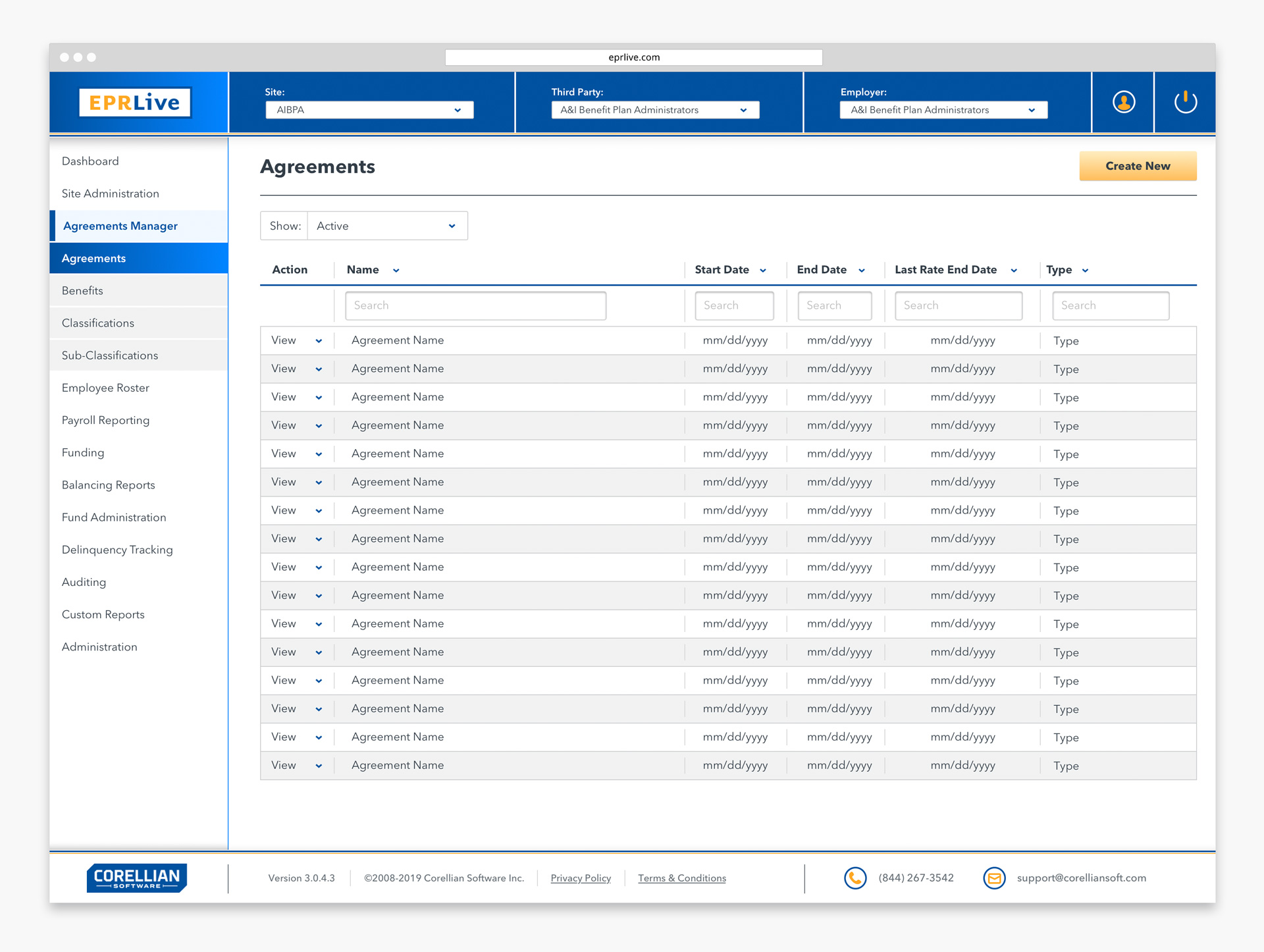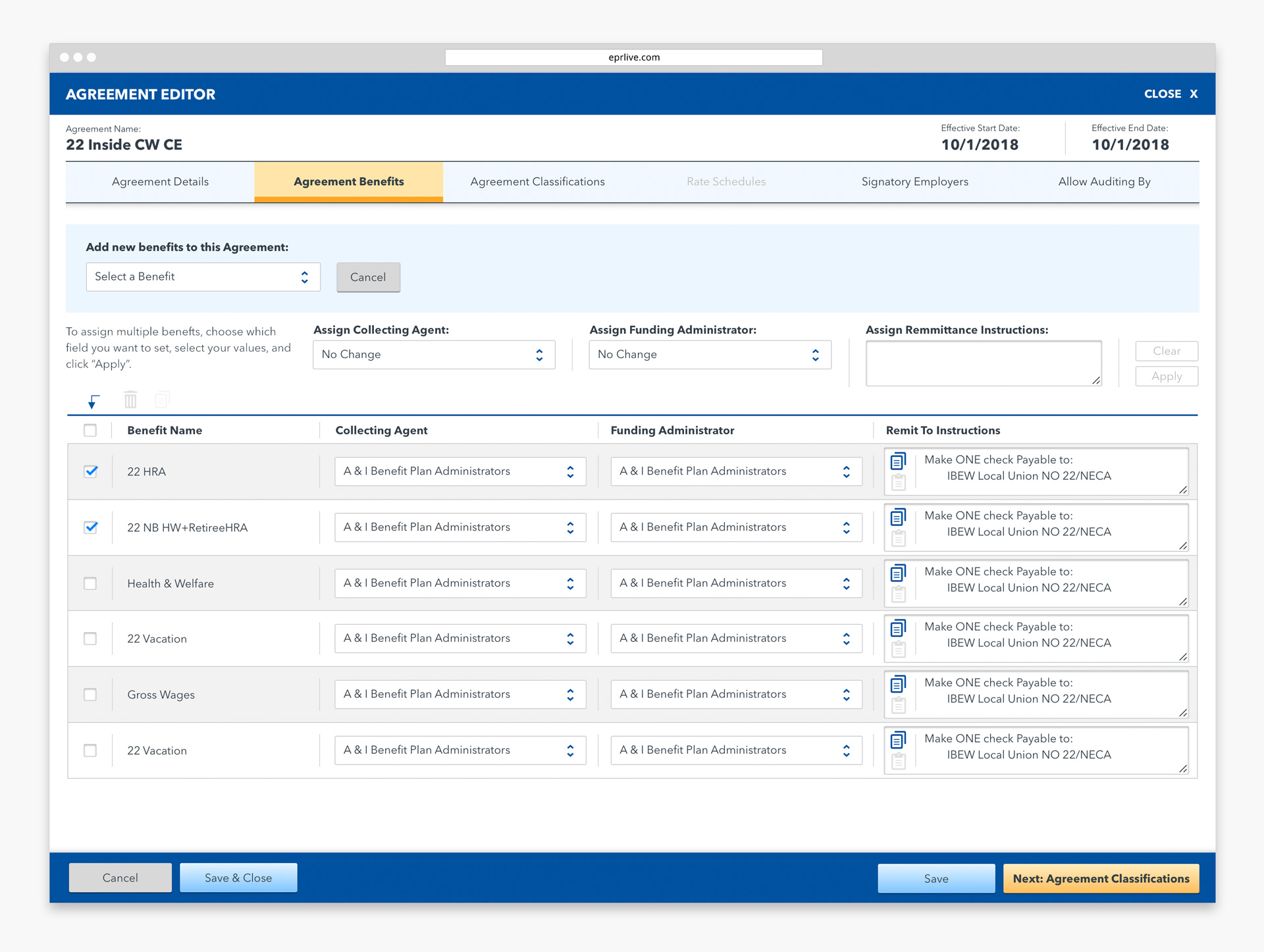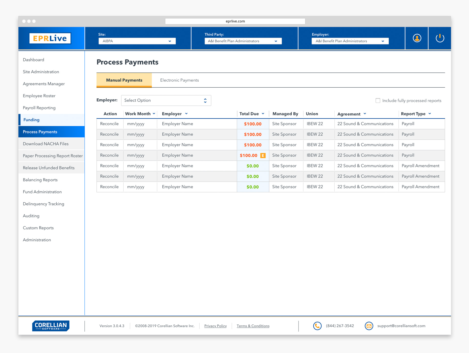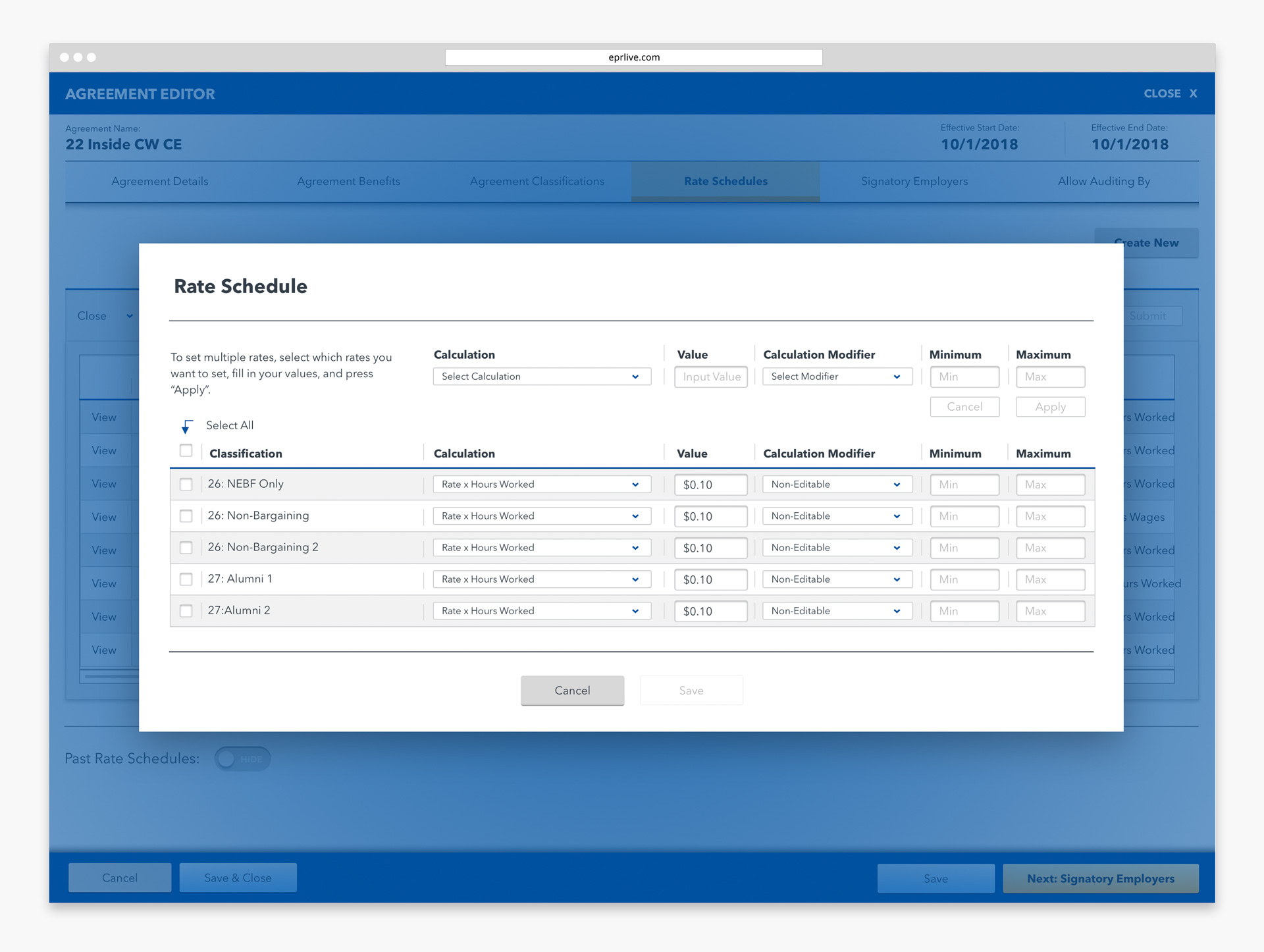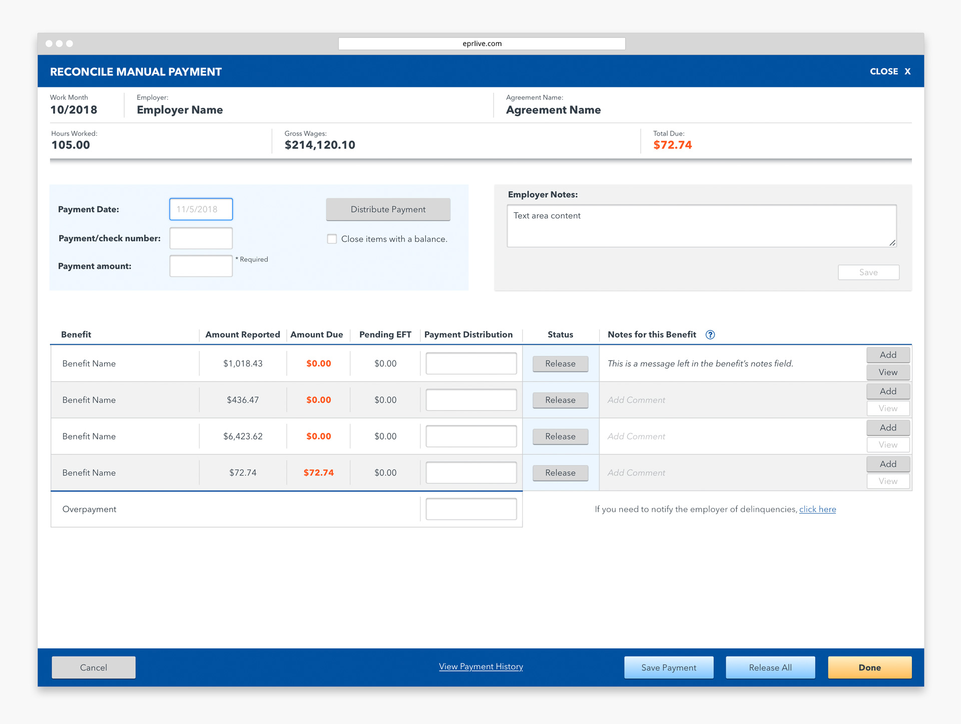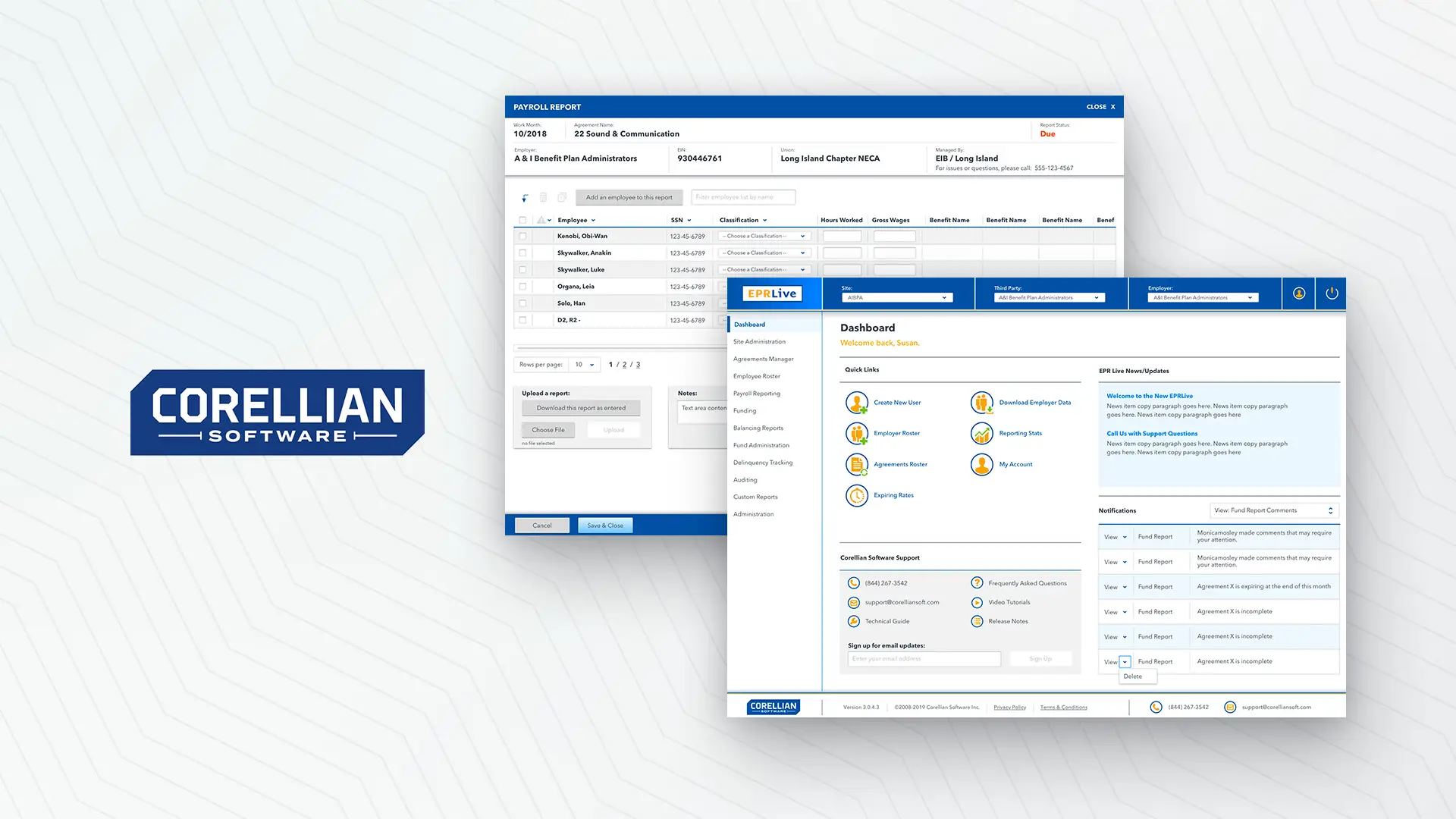
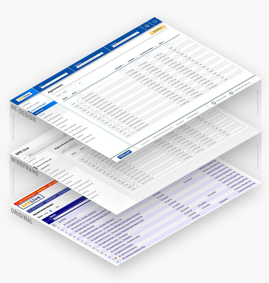
In simple terms, EPRLive is a web-based payroll reporting system that processes billions of dollars in employee benefits each year. Since its inception in 2008, the system has undergone a patchwork of feature updates and fixes, gradually resulting in an abundance of redundant processes and a declining user experience. Wanting to streamline these growing issues, Corellian set us on a mission to rethink and redesign their entire product from the ground up. By breaking the project into critical phases and working closely with Corellian’s Operations team, we gained a clear understanding of what the product does and how it could be made to work better. We removed all unnecessary processes before reorganizing the information architecture into a clear sitemap. We constructed wireframes and conducted testing to ensure the new processes were fluid and comprehensible, and finally polished up the new structure with a fresh user interface design. At the heart of this entire process was a close working relationship with Corellian’s Operations and Web Development teams to ensure a seamless and successful launch.
Services
Strategy
Creative Direction
UX / UI Design
Art Direction
Illustration
Content Production
PHASES OF DEVELOPMENT
/// PHASE 1
Discovery + Learning
/// PHASE 2
Information Organization
/// PHASE 3
Wireframes + Testing

/// PHASE 4
Finalize UI Design

/// PHASE 1:
DISCOVERY + LEARNING
Incubate sat down with Corellian’s Operation and Management teams to learn everything we could about the current functionality of EPRLive and the needs of their user groups. We worked in tandem to flag redundant processes and deficiencies while discussing a strategy towards creating a more streamlined and future adaptive system.
< >
/// PHASE 2:
INFORMATION ORGANIZATION
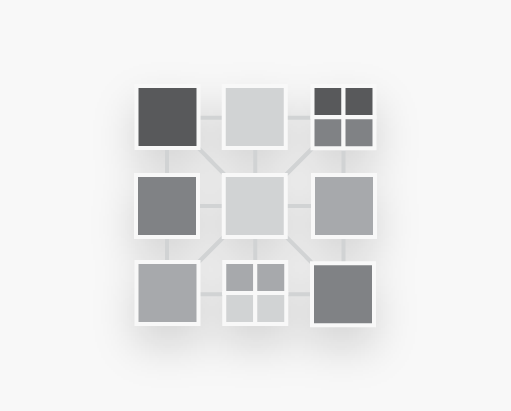
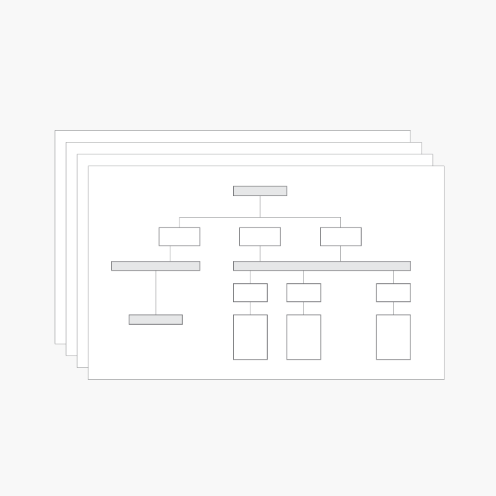
Armed with a new strategy for how the site needs to function, we reorganized and restructured the site’s information architecture to create a clear and direct user flow. A series of UX flow maps were created to illustrate every potential way a user might interact with the product. This process helped define the basic structure of the overall application design.
/// PHASE 3:
UX DESIGN: WIREFRAMES + TESTING
Wireframes of the software application were created to begin establishing a user experience flow. Wireframes were also helpful for beta testing of specific software features or user interaction methods. We collaborated closely with the engineering team to fine tune these details while building out a visual prototype of the web-based software application.
/// PHASE 4:
FINAL UI DESIGN
Incubate finalized the layout and design, color standards, and guidelines based around the structure of the criteria established in Phases 1 & 2. The visual style frames for all features and user interfaces were also created and documented for the development team. Additionally, Incubate designed and produced all the icons and assets in use throughout the software application. In the end, we delivered a master document and corresponding set of files that outlined the detailed HTML coding specifications and usage directions to the developers for implementation.
